Nail your branding, and you’ll be able to control people’s perceptions of your business. Strong branding also means you’ll be recognized. Without a cohesive brand identity, your current and potential customers will quickly forget you.
Branding also helps in other ways, for example:
● Builds trust
● Improves advertising efforts
● Employees will feel like they’re more involved
● Creates loyalty
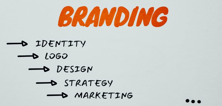
To help you with your branding, there’s a great tool you can use. It’s called brand guidelines, and this is what you’ll learn about here.
What are Brand Guidelines
Brand guidelines also referred to as brand style guides, determine the makeup, design, look, and feel of a company’s branding. In addition, they instruct what your logo, website, blog, advertisements, and other marketing materials look like.
Take a moment to think about some of the brands you know. The chances are that you recognize them instantly because of their branding. The company has a consistent brand message, whether it’s visual or written, that it broadcasts. It will use the same color, language, be cohesive but not rigid.
10 Companies With Killer Brand Guidelines
To give you some inspiration right from the off, here are ten of the world’s most recognizable companies and how they managed to nail it.
Uber
Uber uses nine core elements to communicate its brand to potential users. They include (not in any particular order):
- Logo
- Composition
- Iconography
- Color
- Motion
- Illustration
- Tone of voice
- Photography
- Typography
Uber has even published a brand page where you can see an overview of each element, together with some examples.
Audi
Audi is a name that’s recognized globally. You’ll find it promoted and replicated in countless places. For this reason, Audi has chosen to make its guidelines very specific. Different guidelines apply depending on whether the brand appears in community branding of an enterprise plays a vital part in any business, but nowadays, with so much competition, it’s become more critical than ever. Social media, in particular, exposes consumers to new brands every day. While this is beneficial for them because it provides a myriad of options, it does make life a little harder for businesses.
A fundamental part of your business success depends on going that extra mile to ensure you stand out from the competition. To help you do this, your brand will catch and keep potential customers’ attention.
ication media, user interfaces, motorsports, dealer facilities, and motion pictures. Even alignment and ratios rules have to be applied when their logo is used in branding material.
Carrefour
Carrefour has a colorful and rich history, and they have emulated this in the company’s lively layouts and a broad palette of colors. In the guidelines, its content focuses on warmth, openness, and connections to the brand’s environment.
YouTube
Rather than use the term brand guidelines, YouTube has decided to call its guidelines “Brand Resource.” It contains four brand elements, and you’ll find more details on the YouTube website. The guidelines cover:
- Logo
- Icon
- Colors
- Do’s and Dont’s
The guidelines cover the absolute basics. It’s meant only to get people started. Anyone who wants to use the YouTube brand has to get special approval.
Spotify
Spotify calls its brand documentation “Design Guidelines.” The brand standards are also very specific regarding the creation of content for the Spotify app. The guidelines ensure all users receive the same user experience. The guide describes the following:
● How content is presented on the app, for example, metadata and album artworks
● Linking to and browsing Spotify
● The design of playing views
● Use of the logo
● Color usage
● Typography
● Naming restrictions
Netflix
Netflix has been around for more than 20 years, and its popularity just keeps on growing. The company logo couldn’t be simpler, but together with the “N” icon, they have almost become entities in their own right.
The icon and logo make the brand most recognizable, and the online brand guidelines tend to concentrate on these above everything else.
This illustrates the point that you don’t need to go any further than your brand’s scope for your brand guidelines. The basics are often all that’s required. But, of course, there’s nothing wrong with a minimalist approach.
Nike
We’re focusing on the Nike football brand rather than the parent brand because it illustrates that sometimes a brand within a brand deserves special attention.
Nike places a tremendous amount of importance on the branding side of its business, and it’s managed to emulate the enthusiasm and vitality of the average football fan in its “DESIGN COMMANDMENT,” as they’ve chosen to title the guidelines document.
They’ve even named the color palette “GRITTY” and “RUTHLESS.” And yes, in the document, they’ve used capital letters to emphasize the point. The whole of the manual is passionate and highly effective.
Skype
Skype is a top-rated video chat platform that has adopted a squeaky-clean guide for its brand. Microsoft now owns the company, and the focus for the style guide is logo placement and product phrasing.
Brand manuals often contain photography, but Skype’s main concerns are imagery and type. There is a whole section in the guidelines that detail the drawing of clouds, for example. Skype’s approach to its style document is a whimsical, subtle, but nonetheless clever one.
Google Marketing Platform
There are times when merging two products into one brand is the right direction to take. This happened for Google in 2018 when it decided to join its DoubleClick products and its Google Analytics Suite. The result was a completely new brand, Google Marketing Platform. However, this called for rebranding.
The focus of the rebrand was on being professional, insightful, and trustworthy. But, at the same time, it wanted customers to realize that it was still the same approachable brand its customers loved.
For their brand guidelines, Google has adopted a visual corporate identity, blending powerful visual design elements with simplicity to show how it is for people to understand the brand.
Google itself has undergone several rebrandings over the years, each of which would have required a new set of guidelines.
Shazam
You might not have heard of this brand, but millions of people use this Apple-owned app regularly. It’s a convenient app to have if you ever need to identify a song you’ve heard.
Shazam’s brand assets guidelines adopt a very straightforward approach, and they have mirrored this in the app’s user interface. For example, the role the Shazam logo plays in brand identification and how it should be combined with its watermark in different situations is all clearly explained.
To keep it all exciting and fun, Shazam includes some humor which helps to drive home its personality.
Why are Brand Guidelines Important?
Branding guidelines are important because they define your brand identity and ultimately its personality. Your brand is how your company is recognized by the world, and it helps them trust who you are. However, brand consistency is crucial, or you’ll end up confusing and alienating customers.
With a style guide or brand guidelines in place, it’ll help you communicate consistently across all channels and teams.
Brand Guidelines vs. Brand Books vs. Brand Manuals
These terms all sound very similar, and the truth of the matter is that there’s not a lot of difference between them.
You’ll often find brand manuals, brand guidelines, and brand books used interchangeably. It tends to be more a matter of geographical local or preference as to which one companies use.
Businesses in the UK tend to use brand guidelines. Across Europe, the more common term is a brand book. And in the US, companies tend to talk about constructing a brand manual.
Whichever term is used, the underlying meaning is the same. They are all documents that summarize your brand, starting with brand strategy through to your brand identity and its execution.
How to Create Your Own Brand Style Guide – 5 Simple Steps
Before you can create your branding guidelines, you first have to identify and understand your brand. Five key components will help with this task.
Mission
Your mission statement will explain the reason for your companies existence. The size of this statement doesn’t matter. What counts is that it’s true to your brand.
Vision
Your vision statement explains where you want to take your brand. Look at it on a large scale. For example, you want your business to change things on a global scale. Alternatively, your vision can be much smaller, such as you want to solve an annoying but minor problem.
Target Audience
Who are your customers, and why do they need you? Explain how your service or products helps to solve your target audience’s problems.
Market research can be very helpful, and it will give insights that might help your team and customer communications.
Brand Personality
Think of some adjectives that best describe your target audience. You don’t need to worry about any more than five. You can use these adjectives to set your brand writing and design tones.
It might also help to list the same number of adjectives that don’t apply to your branding. Try an “Is/Is Not” kind of exercise.
Core Values
The core values of your business are its guiding principles for company actions and decisions. If the values are memorable, your team will find it much easier to stay on-brand.
Now you’ve got this part of the process clearly defined, and you can move on to creating your own brand guidelines/ style guide, or whatever you decide to call this vital document.
1. Collect Inspiration
How many times have you heard the saying “A picture is worth a thousand words”? Spend some time looking around and save some reference points that feel like they’re on-brand. If you’ve got multiple teams in your business, get everyone on board. An excellent way to do this is to create a Pinterest board where numerous people can get involved, which ultimately helps to encourage buy-in.
Some questions you can ask include:
● What has worked in the past? Consider and collect examples of previous emails, mailers, messaging, business cards, and ads that were successful.
● What are your competitors doing, and is there anything in particular that you like?
● Are there any questions that come up time and time again?
The answers to these questions will help define your brand’s look and feel. Keep notes about specific likes and dislikes.
2. Define the 6 Most Essential Elements

Now you’ve gathered some inspirational material, and you can start putting your brand guidelines together. Of course, many companies choose professional designers at this stage, but it is possible to do it yourself.
There are six essential elements all brand style guides should include. They are:
- Brand story
- Logo guidelines
- Brand color palette
- Font and typography guidelines
- Image guidelines
- Brand voice
Brand Story
Your brand story is an excellent way of introducing your brand to the world. You’ll be providing an insight into your company’s heart and soul. You can include the five essential components we’ve already looked at, such as mission and vision, target audience, brand personality, and core values. However, you can choose to include just a couple or none at all if you want to.
Logo Guidelines
You might already have a clear image of your logo, but have you thought about the color and how it might look in various environments? In this section of your brand guidelines, you’re setting out the rules to ensure your logo design is used as you wanted it.
Having the size, space, and colors laid out will ensure no costly mistakes such as altering, stretching, realigning, or condensing. If any of these mistakes should happen, it could send out the wrong message.
Include examples of all approved versions and describe when each one can be used. Ensure the following are clearly defined:
● Size: Provide minimum size and approved proportions
● Space: Are there specific requirements for the amount of space around the logo?
● Colors: If there are any variations, give details and provide examples and describe when to use them
● Don’ts: These are just as important. Clearly explain how your logo shouldn’t be used.
Brand Color Palette
If you can define the color palette for your brand, it will help create a consistent look and feel. It’s common for companies to choose no more than four primary colors. A good tip is to stay close to the hue of your logo.
Another good tip is to choose lighter colors for backgrounds, darker colors for text, along with a neutral hue, and one that really pops.
Include swatches of your chosen brand colors, together with information that will ensure the colors are reproduced accurately. List the following information:
● Color Match: PANTONE numbers and names are recognized globally
● Print Color: CMYK
● Digital Codes: HEX and RGB codes
Font and Typography Guidelines
Your choice of font is another crucial part of brand design. Depending on your brand’s needs, you might find one typeface is enough, or you may need to choose multiple fonts. A generally recognized rule is to use a font that’s different from your logo. This will ensure it stands out.
Whether you choose a simple or more complex typography scheme, in this section, you must explain the proper ways to use it and provide clear instructions on the alignment and spacing. It’s also important to tell the story of the typefaces, what they are used for, and their relation to your brand.
Image Guidelines
It’s your company and, therefore, perfectly natural for you to know what is suitable for your brand, but that’s not the case for everyone else. With the imagery section of your guidelines, you can steer people in the same direction as yourself.
There are several ways you can approach this section. For example:
● Mood Board: Gather together some images that convey feelings you want people to experience when interacting with your brand
● Aspirational: It’s not always possible to have examples of what you want, so why not look for images that feel right from other brands?
● Best practices: Are there any images that have proved successful for your brand in the past?
Brand Voice
Brand voice can have a massive impact on what your audience feels about you. Think about words you like and words you don’t like. As before, there are a few ways to approach this section of your guidelines:
● Build on Personality:
● Best Practices:
● Do’s and don’ts:
3. Decide Whether You Need to go Deeper
The six elements above are critical for most organizations. However, there are occasions when it might be necessary to go deeper.
If your brand is primarily digital, you might need to codify the layout of website images and your tagline. You might need to include packaging guidelines and explain when the product name should be used rather than the company name if you sell products. If your focus is social media marketing, guidelines for post images might be necessary.
Brand style guides are personal to individual organizations. You can use a template, but ideally, your guide should match your organization.
4. Create an Outline
Step number four is to create an outline for your document. It will help determine the guide’s structure. Then you’ll need to decide whether your rulebook should be a digital PDF, be printed, or made available online.
Remember the document is a work in progress, as this should help you decide the best course of action. All the information needs to be readily available and easy to find.
5. Plan Your Brand’s Evolution
Brand guidelines are living, breathing documents. As you use it regularly, you’ll come to appreciate what works best. It’s also possible to add or adjust the information at any time. By creating this document, you’ve already taken the most crucial step and built a solid foundation.
However, revisiting it is just as important. Find a place to store ideas when they arise, so they are easy to retrieve at reviewal time. Make a note in your calendar to revisit and review the guidelines, whether monthly, quarterly or once a year.
Tips on How to Create The Best Brand Guidelines
Before you put pen to paper, so to speak, here are a few tips to help with the creation of your strong brand guidelines.
1. Include Dos and Don’ts
For your brand guidelines to be beneficial, they must tell what you should and shouldn’t do. Doing this ensures your usage requirements are visual and presented in a way that’s easy to understand.
For example, you might want to make sure your logo is never placed against backgrounds that are a similar color or high-contrast. Also, if you don’t want the logo tilted or to have added embellishments, make sure you let readers of the document know what will happen if they break the rules.
2. Be Specific
There’s nothing wrong with keeping things simple, but the more details you include, the better. Try to use specific scenarios and how colors, imagery, and fonts can be used.
You might decide there are specific fonts for almost every communication channel. In this case, you’ll need to describe font names and styles for headlines, titles, and body copy. But, again, there will be no room for uncertainty if you explain how the rules should be applied for print and web content, internal employee events, emails, and other channels.
3. Guidelines Need Branding Too
Your guidelines should also reflect your brand and showcase its vibe. Add some minor touches in keeping with your guidelines.
One way to do this is by using color accents and a logo icon when numbering the pages. In section headings, use your brand fonts and colors.
4. Your Primary Color Needs a Name
To take your branding one step further and solidify it. Give your primary color a name. Netflix, for example, has named its primary color “Netflix red.” Likewise, Spotify uses “Spotify green” while HubSpot uses “HubSpot orange.”
Why is this so important? First, it creates a certain air of importance and stakes a claim on your primary color.
5. Consider Hiring a Professional
Branding is a huge deal, and it makes sense to do everything you can to get it right. However, if there’s no one in your company with any graphic design skills, you might need the help of a professional.
Such services don’t come cheap, but investing in a branding and design expert is a wise investment to make. However, if you’re looking for a more affordable option, there’s loads of help and inspiration available online.
6. Be Consistent
If you want your brand to stand out and stick in people’s minds, the key is brand consistency. From your choice of primary color to the font you choose for your company emails, business cards, and messaging, every little detail is important and counts.
Your brand guidelines are an invaluable tool because they lay out all your branding rules and ensure they get followed. In addition, if you find yourself partnering with other businesses, these guidelines will be handy when they use visual brand elements in advertisements and promotions.
When you’re proactive and ensure everyone is singing from the same hymn sheet, you’ll have optimum control over your brand image.
Final Thoughts
Now you’re ready to create a brand style guide template of your own. If your brand is strong, it tells everyone why your company is better than others on the market. It also helps your team stray true.
Some brand guidelines are pages and pages long, while others can be condensed into one page. How you choose to write your guide depends on your business needs.
Most importantly, you should list the essential brand elements because these will act as a single reference point for any design or branding projects in the future.
If you found this comprehensive guide to brand guidelines helpful and are ready to write your own, we’d love to hear how you get on. So please leave a comment below, and perhaps you’d like to include your freshly written style guide for reference.